Hey you guys! Thanks for stopping in today. Last weekend my Mother-in-Law was over at our house for a BBQ and she asked me to make her some thank you cards since she'd run out. She's got a birthday coming up so I'm trying to make her a set of really pretty cards for her stash. I just got this new set from Altenew and it so darn pretty to look at! FYI it's called Hello Gorgeous for good reason. I chose the largest flower stamp from the set and heat embossed it in gold onto watercolor paper.
Then I used four colors of ink total to watercolor. Sometimes I think it's good to try to use fewer colors as it forces me to work on blending and creating new colors. The flowers were done with a pink and a yellow ink that I blended to make different shades of oranges.
After watercoloring the flowers I added some blue to the background and then added some spatters to grunge up the background a bit more.
The sentiment is from a Concord&9th set called Grateful for Everything (another mindblowingly gorgeous set). I love the font of this sentiment and I thought it was perfect for a thank you card that didn't actually say, "thank you."
I haven't played along in any challenge blogs for a while so I'm going to link my card up to the Simon Says Stamp Monday (Stamp It On) and Wednesday Challenges (Anything Goes). I'm also going to play along with the Altenew monthly Inspiration Challenge for the first time. Here's the inspiration photo that they've posted and I went with the theme of floral when I made my card.
That's all for now but I will be back soon as I am blog hopping with the Let's Get Hopping crew in less than 24 hours. I hope you have an amazing day and I will see you back here soon!
Happy Saturday everybody! I am stopping in with a quick hello and a sympathy card today. Sometimes I like to sit down and color without thinking about making a final product. When I do that I try make sure I stamp my image on a piece of cardstock that measures 4.25" x 5.5" so that I can turn it into a card face if I want to. I stamped this Floral Rose from Hero Arts onto a piece of shimmery white cardstock using Memento Ink. Then I used my Copic Markers to color it while watching a movie with my family.
I used a couple of different pinks, some cool grays for shadows... and yellow as a "magic maker." After I was done coloring I went back in and added detail with both a fine tipped sharpie and a white gel pen. This helped me to make some of my shadows darker and my highlights brighter. If you are familiar with the original image of this stamp you'll notice that my card is bit grungier... I couldn't help but add some scribbles, details and dots when I had my sharpie out.
That's it for today guys. If you've got a hankering to do a little coloring of your own, and you'd like to pick up this stamp for yourself, you can easily find it through the Hero Arts link below.
Well, holy moly. It's been a really long time since I've been here to share with you. Not surprising since I don't think I've actually finished a project in over a month (yikes!). I've just gotten back from an amazing trip to Belize where I visited a ton of family and snuck a few days of vacation on an island into the trip. While I was on vacation I did get a little coloring in and now that I'm back it's time to turn my colored bits into cards... I got inspired by this month's A Blog Named Hero challenge of Sparkle & Shine and decided to work with that.
I actually watercolored this mermaid before I went on vacation but decided she was perfect for this challenge. I used the Hero Arts liquid watercolors then I added a little bit of copic coloring and some gold gel pen on her hair and tail.
The background was watercolored in some fun colors and then I used a Hero Arts stencil and some sparkly embossing paste to create a subtle but glittery background. I love the texture that this creates on the card without totally stealing the attention from the mermaid.
I die cut some long fronds (are they fronds?) of seaweed in silver foil and attached those with glue dots. The sentiment and some sparkly sequins finished the card off.
Thanks for stopping by my blog today-I am sorry that I have been so MIA! If you have any questions about this card please feel free to leave me a comment below or shoot me an email. This challenge was really fun for me so if you are interested in playing along, or, just want to check out the gorgeous projects from the design team and other participants then head on over to the A Blog Named Hero challenge blog and enjoy!
Hey Everybody! I'm here today with a quick post. I finally had time to get back into my craft room last night (think VERY early this morning) and I had a little fun with this gorgeous mermaid from the Swimming By stamp set from Honeybee Stamps. I also used my new Arteza Real Brush Pens for the first time and I love them!
I started out with the Mermaid's tail and used two green markers and a blue to get some fun shading. Then I moved on to her skin and shells. For most of the card I applied color directly to the watercolor paper with my Arteza Real Brush Pens and then I used a water brush (paint brush with a water-filled barrel) to blend the colors. I did her shells a little differently as the red color that I wanted to use was a bit bolder than I wanted it to be. I colored the red ink onto a piece of acrylic. Then I used my water brush to pick up the color and paint it onto her shells. It worked perfectly to dilute the color. I wanted a little extra shading on the sides of the shells so I went back in with my brush pen, added a little color directly to the edges and then blended it with my water brush. It worked the way it was hoping I would and I love how versatile these pens are.
My favorite part to color on this mermaid was her hair. I'm a little obsessed with mixing and blending odd colors right now and for her hair I picked two purples (light and dark) and a teal green color. They blended together to make some really fun shades of purples, blues and greens. I laid down the color first, then blended making sure to leave the highlighted areas with less pigment. After watercoloring I went back in and added more color where it was needed.
I painted my background using both my Arteza Real Brush Pens (two blues for the water) and Distress Oxide Ink in Frayed Burlap (sand). Then I heat embossed the sentiment in black (sentiment is from Mermaid Song by Honeybee Stamps). I finished off my card by using a white gel pen to add highlights and details to the mermaid and background and glueing on some sequins from Hero Arts.
That's it for today folks! Just in case you'd like to pick up a set of these amazing watercolor markers or one of the stamp sets I used for this card I will add some links for you below. If you have any questions please shoot me an email or leave me a comment below.
I know, I've been... not here. This summer has been wild and wooly (and not in a "I've been living at the beach" kind of way) and I have not had as much time to create as I would like. Still, I am grateful for the time that I do get and this past weekend I got to do some really fun things so I can't wait to catch you up on that (amazing classes with Dina Wakley on gelli printing and creating transparent layers in the media journal-it was epic!).
For today I've got a card to share. I colored this flower last month when I was participating in Kathy Racoosin's 30 Day Coloring Challenge. I finally had time to turn it into a card and here it is...
The flower is colored with Copic Markers in the following colors: BV00, B02, B41, BG01, V00, RV23, YR61. The leaves are colored with YG41, BG10 and BG23.
After coloring and die cutting my flower and leaves out I layered them on top of some gorgeous pearlescent paper from Paper Garden that I die cut with the Papel Picado Confetti die (Hero Arts). A while back Paper Garden sent me some gorgeous paper to sample and this paper is truly beautiful! After that I heat embossed my sentiment in white on black cardstock and adhered everything with foam adhesive.
I added a few sequins to finish the card off and called it good. Ok, that is it for today! I'm going to take some pictures of what we did in Dina Wakley's classes this past weekend and I will be back soon to share it all.
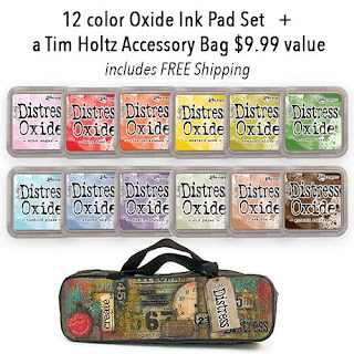
Surprise, surprise!! Tim Holtz just released set number four of his amazing Distress Oxide inks! If you follow my blog at all you have definitely seen these in action but if you are new and haven't seen them before... They are truly amazing inks! They have the properties of both dye and pigment inks mixed into one ink. You can stamp or blend with them just as you would a normal ink but when you add water to these inks things start to get a little crazy (crazy amazing!). These inks oxidize when they are combined with water and you can get some really cool effects by doing this. You can also layer these inks because of their pigment ink qualities. This gives you opportunity to create in ways that you never could with regular dye inks. I'll share a couple of cards that I've made using Distress Oxide inks in the past but first let me share the link to the new set of inks as they are sure to sell out fast.
Ranger is offering a FREE Tim Holtz bag to carry your inks in as well as FREE SHIPPING so snatch up this deal on the double! I just ordered mine and the other thing I added to my order was the new Alcohol Lift Ink which I cannot wait to get my hands on!
Ok! Here are a few examples of cards that I've made using the Distress Oxide inks in previously released colors.
This background for this seal card was made by sponging, blending and watercoloring with Distress Oxides.
This bright background was created by blending the Distress Oxide inks and that spritzing with water to oxidize the ink.
Both of these octopus cards were created by blending Distress Oxide Inks, spritzing with water, spritzing with Distress Spray and repeating the process multiple times. The effect is really cool in person as the background has texture from the Distress Spray. I wish you could touch it and feel for yourself!
This background was made by using the Ink Smooshing technique with Distress Oxides.
These two were ink blended and then both lightly misted and heavily splattered with water.
This last card was ink blended and then I flicked water onto the background at an angle to make the drops appear like falling rain. In this card you can really get an idea how these just blend like butter. They are so smooth and forgiving to work with and I love the chalky, matte finish they have (with no chalky residue!).
Ok, guys! That's it for today! If you want to check out any of Ranger's other amazing products I will leave you with the link below. Enjoy and have an amazing day!
Hi guys! I hope you all are doing well and getting lots of crafting time in. I have been a wild woman this past week. My son got out of school and got his first job! We've been so busy with paperwork and meetings and shopping for his work uniforms (among other things) that I haven't had much time to craft or even to blog the things I made weeks ago. I do have some AWESOME news though!
I started out the month playing along with Kathy Racoosin's 30 day coloring challenge (and fell off the bandwagon when life struck but that's ok!). A while back I realized that her Coloring Challenge Road Trip would be at Hero Arts which is only a couple of hours away from me! I was so excited at the possibility of attending and then so bummed when I realized that I was too late and the event was full. I decided to message Kathy to see if there was a waiting list. Today I heard back from Hero Arts and there is room for me to attend! That means that this coming Saturday I will be spending the day at Hero Arts with an amazing group of crafty people. We will just color all day long and apparently eat turkey sandwiches for lunch. Woohoo! So, this is the perfect chance for me to share some of the projects I've made recently using Hero Arts products.
This card features the June My Monthly Hero kit and one of the add-on sets called Seal of Approval. This card was custom ordered for a boy (Ethan) who was turning ten.
I sponged the sand and stamped the ocean with Distress Oxide inks. I wanted a softer look to the ocean so before stamping the second and darker layer of water, I spritzed the inked up stamp to oxidize the ink. I was happy with the way it blended into the larger body of water. Instead of stamping the third layer of water with the finest detail in ink... I decided to use my White Puff Embossing Powder from Wow Embossing to add some sea foam to the top of the water. I love how that embossing powder adds life and texture to the card. I watercolored the sky with Distress Oxides and stamped the clouds in white pigment ink. The clouds weren't bright enough for me so I used a white gel pen to outline the tops of them. Last, I stamped the birds in gray archival ink.
Now, since this card was for a ten year old I decided to make it interactive and I rigged a little mechanism on the side to make the ball bounce around a little. Here's what it looks like when it's in motion...
It's pretty basic but apparently Ethan loved it and that is all that matters. It was pretty simple to make but I wanted to share a picture of the guts of the card so that you could see what I did. After coloring the ball with Copic markers I used a hole punch to punch out a hole that was smaller than the ball. I wanted the ball to have room to move without the hole being visible from the front of the card. I put a small piece of foam adhesive on the back of the ball and fit the adhesive through the hole that I had punched. Then I used a 1/4" strip of cardstock to connect two circles that I had punched out with punches (but you could also dies or cut by hand). I attached the larger circle to the foam adhesive on the back of the ball and placed it so the smaller circle would stick out the side to move the ball around. Then I used foam adhesive to create a channel for the mechanism to sit inside, added adhesive to the rest of the card and attached it to my card base.
My seal was also colored with Copic Markers. Ethan's name was created by die cutting the letters out of paper that was sponged with color. I taped off the bottom half of the letters and used the Sand Embossing Powder that came in the kit to heat emboss the top of his name. You can't see it in the photo but the sand EP has quite a bit of copper in it and it gleams like Fool's Gold. It's a really cool product!
This set made it so easy to create a gorgeous beach scene that I am sure I'll be using it often in the future.
I'm going to enter this card into the A Blog Named Hero monthly challenge. The theme for this month is Summertime Fun and I think this card fits the theme.
Alright, y'all. It is late in my neck of the woods and I need to head off to bed now. Thank you so much for stopping by and I will see you back here soon.
Hey guys! Guess what? I have a new blog header...did you notice? I don't make big changes very often and the colors in my new header make grin stupidly so I'd say I'm pretty happy with it (Thank you for the pretty work Fancy That Jane!).
Today I want to share a card I made using a set from Waffleflower Crafts called Bouquet Builder 1 Combo. I love these long stemmed buds of flowers and I decided to color them in using my Copic markers (I can't remember which colors I used-I'm sorry!).
I wanted to do something different for the background so I decided to try sponging on some Nuvo Embellishment Mousse with a sponge dauber. I started by embossing my background piece. Then I light sponged the mousse over the raised areas of the background to make them pop (and shine because this mousse is so glimmery!). I got a little heavy handed in the bottom corner but overall, as long as I was careful, this technique was pretty easy to pull off.
Here's a close up of those gorgeous flowers... even the stems and leaves are beautiful. I colored and die cut two sets of flowers and then layered them to get a fuller look.
Here's a last look look at the full card. Have you tried out this Nuvo Embellishment Mousse yet? This was my first time using it and I found it really easy to work with. I just ordered a few more colors because there's a lot you can do with it. Aside from sponging it onto your cards, you can also use it with a mask like texture paste, watercolor with it, or even make your own custom spritzers with it. It's pretty cool stuff and I'm looking forward to playing around with it more now that I have more colors. I will add a link below just in case you're interested in picking some up for yourself.
Alright folks, it's late and I have work tomorrow. Even crazier than that, my son has his first job interview tomorrow and I need to go make sure I don't have to iron a shirt for him (Update: I ironed four shirts...). Fingers crossed he gets the job!
Hello everybody and welcome back for another fabulous TGIF Challenge! I'm sad to say that this will be my last week with the TGIF Design Team. If you follow my blog then you know that I've resigned from Stampin' Up! so that I can expand my creativity and use products from all of the amazing stamp and craft companies out there. TGIF is a team that is made of SU Demos. As I am no longer a demo I am stepping down from the design team. I am excited for my new crafty adventures but this design team holds a special place in my heart as all of the members are really wonderful human beings. I will miss creating alongside them.
This week we've got an awesome Sketch Challenge for you! Here's my take on it using a new stamp set from SU's new catalog. The set is called Sea of Textures and has a matching set of dies that is pretty epic! I started out by watercoloring my background and a bunch of extra pieces of paper to cut my shells and coral from. Then I layered a piece of vellum over the background and started arranging my pieces.
Here you can see close up of the gorgeous die cut pieces. The sand dollar is really cool bc you can pop the center out or leave it in.
The sentiment is heat embossed in white embossing powder and I added a blue sea star to the banner to anchor it to the design. If you look closely, you can see that behind the seagrass I added some blue dots for detail with an alcohol marker.
The octopus is stamped in Gorgeous Grape ink and heat embossed in clear. He's such a cool looking guy and I like that it looks like he is walking across the sea floor.
That's it for today you guys! If you'd like to see what the rest of the Design Team has done with this sketch then head on over to the TGIF Challenge Blog! Here's a graphic of the sketch for you to check out. If you've got a great idea on how to interpret it then please play along with us this week!
Bye guys! I'll be back with another fun post in the next day or so.
Hey Everybody! It's been a while since I've posted and I'm sorry for being a bit MIA. A lot has been going on in the last couple of weeks. I've been trying to knock things off of my "to-do" list and I've been running around like a chicken with my head cut-off. The end of "things to do" isn't really in sight but I'm so glad to have the time to say hi to you guys today. I have been crafting but haven't had time to photograph and blog much so I'm sorry I haven't been sharing here.
Anyhow, on to today's card because I'm sure that's why you are here... And, I absolutely LOVE what you can do with the Nuvo Shimmer Powders that I used on this card! It was my first time using them and they are easy to use and you can get such a variety of gorgeous effects with them (video coming soon!). The shimmer powders made the perfect, magical background for the astronaut and planets from Reverse Confetti's Moon Men stamp set. I'll put a link to the Nuvo Shimmer Powders at the bottom of my post in case you'd like to pick them up for yourself.
Here's a close up of the background. I started with a piece of watercolor paper and used just three colors of shimmer powder to create this background. I started out by tapping out some of the powder onto the dry paper and then I spritzed it until I saw the powder activating. Depending on how much water is on your paper you can tilt it back and forth to mix the colors, or, you can use a paint brush to drag them around to where you want them.
I colored my Moon Man and the planets with Copic Markers. I wish I could remember what colors I used... but I made this a few weeks ago and didn't make note of what I colored with before cleaning up my desk.
If you look closely at the purple planet you can see that I also added a little bit of the black shimmer powder to add some shading. It looks cool in real life bc it glitters when you move it. I heat embossed my sentiment in white added it to the card with foam adhesive.
I used some awesome Crystal Clear Confetti sequins by Studio Katia to finish off the card. These sequins have a gorgeous iridescent look and have no hole in the middle which I love! It makes them so easy to adhere as you don't have to worry about glue seeping out the hole in the center.
Before I go I'm going to enter this card into a couple of fun challenges