Hi Everybody! I'm so glad to have you here today because it's been forever since I've taken part in a blog hop and today I am hopping along with the crew from Let's Get Hopping. This month the theme is "Not Your Standard Card." Many card makers stick to making the standard A2 sized card (4.25" x 5.5") and don't deviate much from that size. This challenge is great because it forces us to think a little bit differently and I can't wait to see what sizes and shapes the rest of the crew has come up with.
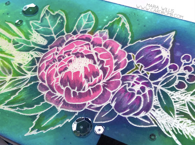
I've really been looking forward to using this gorgeous stamp that I just got from Concord & 9th called Grateful for Everything. It is such a beautiful floral image and even though it's intended for the Fall season I just wasn't ready to take it that direction yet. It's perfect for this challenge because the image is large and won't fit on an A2 sized card. This gave me the chance to make a narrower, wider card and fill it with this beautiful image. I heat embossed it in White Satin Pearl Embossing Powder (PW118) from Hero Arts. This embossing powder is so pretty because it takes on a little bit of the color of cardstock that it is embossed on and is pearlescent (sentiment is also embossed in this same EP but looks different because it's on black cardstock).
After heat embossing the image I sponged it using my Distress Oxide Inks (colors listed at bottom of post). These inks are such a dream to blend! They look creamy, have a matte finish and even oxidize when you add water. After sponging I flicked some water droplets onto my card with a wet paintbrush. Then I used a paper towel to absorb the water which left behind some pretty, light colored splatter.
Next, I used a technique that I learned from the talented Kelly Latevola. She calls it water color bleaching (I think I've called it ink lifting in the past) but then she takes it a step further and incorporates some copic coloring to make her images really pop off of the page. Here's a link to the video I watched where she demonstrates this technique: CLICK HERE. Anyhow, I used a wet paint brush to color over my image. As I wet the image I pressed a paper towel over it to remove some of the ink so that the image looked "bleached." This doesn't remove all of the color but it does leave it looking faded out. After that I went back to the image with my Copic Markers and added shading and drop shadows to give it more detail and add back in some more color where I wanted it.
I heat embossed the sentiment from Altenew in the same Hero Arts embossing powder that I used on the floral image. It looks a bit darker and more silvery against the darker cardstock. I popped the image up on foam tape to give it a bit of dimension.
To finish the card off I add a coat of Wink of Stella to my image. Then I added some clear sequins in a variety of sizes to give it a little more sparkle.
Well, that is it for today folks. I hope you've enjoyed my project because I really enjoyed trying out a new (to me) technique. I've put a list of the products that I used and links to the shops where they can be purchased just in case you're interested in trying this technique out for yourself. I am also entering this card in the Simon Says Stamp Wednesday Challenge (Anything Goes).
I hope you'll keep on hopping along with us to check out what the rest of the crew has made for this hop. You can head on over to Jennifer Frost's blog by clicking the next button below.
Have an amazing day!
Maria
PRODUCT SUPPLY LIST AND SHOPS (just click the logos to shop):
-DISTRESS OXIDE INKS:
Picked Raspberry
Twisted Citron
Lucky Clover
Peacock Feathers
Wilted Violet
-BLENDING TOOLS
Ranger Mini Ink Blending Tool (Round)
Ranger Mini Blending Tool Replacement Foams
-PAINT BRUSH
Tim Holtz Waterbrush Detailer Tip
-Tim Holtz Tools by Tonic Stamp Platform
-White Satin Pearl Embossing Powder (PW118)
-Hello Gorgeous Stamp Set


Wow! So beautiful, I love the colors!
ReplyDeleteThank you Nina!
DeleteJust stunning Maria. You have such a talent for colouring!
ReplyDeleteThank you Jennifer!
DeleteWow Maria..I love those colours and how that technique gives such a range of shades. So glad you joined us today
ReplyDeleteThanks Tanya! I was so glad I join in this time around!
DeleteWow, what a popping card. Love your colouring skills! Thank you for sharing.
ReplyDeleteThank you Eva!
DeleteOoohhh Maria, I absolutely love your card, the vibrant colours are so pretty. So much work, creates a very stunning card.
ReplyDeleteThanks Tracy! It was a lot of work but it was also really fun to make.
DeleteBeautiful card with such vibrant colors!! I LOVE it!!
ReplyDeleteThank you Diana!
DeleteThis is beyond words... Gorgeous! Thanks so much for the explanation of the technique! OXO
ReplyDeleteThank you Carolynn! Can’t wait to see if you’ll try this out for yourself!
DeleteBeautiful card, the colours are awesome!
ReplyDeleteThank you Tracey!
DeleteAmazing card love the embossing resist and the colours gorgeous.
ReplyDeleteThanks for sharing love it
Thank you Teresa!
Delete